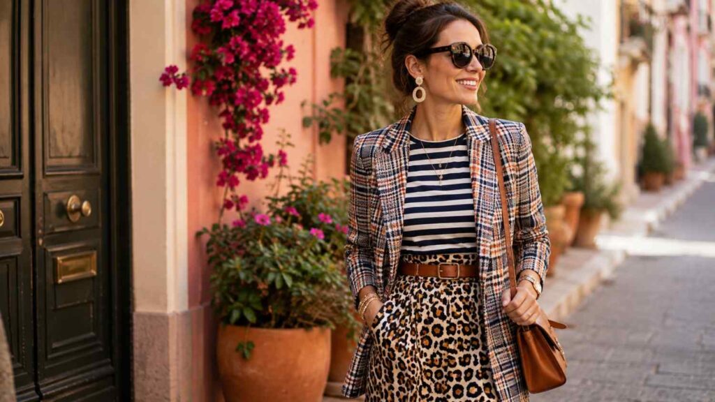
How to Mix and Match Patterns Like a Pro: A Complete Style Guide
Learning How to Mix and Match Patterns Like a Pro becomes far easier once you stop thinking of printed clothes as pieces that must “match” perfectly. Strong mixed-print outfits are usually built around visual relationships rather than identical designs. Color, scale, contrast, proportion, and repetition create those relationships and help seemingly different patterns belong in the same look.
A striped shirt does not resemble a floral skirt, yet the two can work beautifully when they share a color and have noticeably different print scales. Similarly, plaid trousers can pair with a patterned blouse when one design is visually dominant and the other remains quieter. The objective is not to remove contrast. Contrast makes pattern mixing interesting. The real goal is to make that contrast look controlled and intentional.
Pattern mixing can suit many styles, from restrained office dressing to expressive maximalism. Current fashion styling has also renewed interest in bolder print combinations, but you do not need to dress like a runway look to use the technique effectively. The same principles work with a pinstriped shirt and subtle check, a striped sweater and floral scarf, or a patterned skirt paired with a small-print blouse. Once you understand how color, scale, and visual hierarchy interact, pattern mixing becomes a practical styling skill rather than a risky fashion experiment.
How Do Pattern Mixing Rules Actually Work?
Pattern-mixing rules work by controlling the amount of visual competition inside an outfit. Every print has characteristics that influence how strongly it attracts attention: color contrast, motif size, spacing, direction, density, and overall complexity. When two highly dominant patterns appear together without any visual connection, the eye may struggle to determine where to focus. Successful styling introduces enough contrast to create interest while maintaining enough structure to make the look feel purposeful.
One of the most useful ideas is visual hierarchy. Instead of expecting two prints to carry equal weight, allow one to become the primary statement. The second can reinforce the outfit through a shared color, smaller motif, softer contrast, or simpler design. A large botanical skirt with a fine striped blouse is easier to read than an oversized floral combined with an equally oversized, brightly colored geometric print because the first pairing has a clear visual order.
A useful pattern-mixing approach is to consider pattern scale and color together, using one larger print as the focal point and smaller designs or solid pieces to keep the overall look balanced.
These ideas should be treated as practical tools, not permanent fashion laws. Experienced dressers often combine several bold prints successfully because they understand which visual element is creating cohesion. Beginners benefit from establishing that structure more deliberately. Start with one dominant print, vary the size of the second pattern, repeat a color, and simplify the silhouette. Once those fundamentals feel intuitive, you can deliberately introduce stronger contrasts, competing colors, or multiple patterns while still preserving an intentional overall composition.
Use One Dominant Print and One Supporting Print
A dominant print is the pattern you want people to notice first. It may appear on the largest garment, use the strongest colors, contain the biggest motifs, or simply have greater visual contrast. A bold floral midi skirt, graphic plaid coat, abstract dress, or oversized striped trousers can all function as the main statement around which the rest of an outfit is built.
The supporting pattern should add interest without fighting for equal attention. A fine striped knit beneath a dramatic floral jacket, a tiny dot with an oversized check, or a quiet houndstooth accessory beside a bolder abstract print can create depth while maintaining a clear focal point. Think of the secondary print as reinforcing the visual story rather than starting a second one.
This hierarchy is particularly valuable when an outfit feels “too busy” but you cannot identify why. Often, the problem is not the presence of multiple prints; it is that both prints are equally loud. Reducing the contrast, color intensity, or size of one pattern usually creates a stronger relationship. The viewer can then register the dominant piece first and discover the secondary print afterward.
Change the Scale of Your Patterns
Pattern scale refers to the apparent size of a repeated motif. Thin pinstripes, tiny checks, and small ditsy florals are examples of small-scale patterns. Broad stripes, oversized flowers, large tartans, and dramatic geometric shapes occupy much more visual space. Understanding scale is one of the fastest ways to improve mixed-print outfits.
Combining clearly different scales helps prevent patterns from visually blending into one another. Wide stripes can work with small flowers because the eye easily separates their rhythms. Large windowpane checks can sit beside narrow stripes for the same reason. Even two florals can coordinate when one features oversized blooms while the second uses a much smaller repeated motif.
When a pattern pairing seems almost right but still feels uncomfortable, compare the size of the motifs. Two prints with similar scale, similar contrast, and similar density may compete even when their colors coordinate. Changing just one of those variables can solve the problem. Scale is particularly useful because it creates separation without requiring you to abandon the color palette or pattern combination you already like.
How to Mix Patterns Step by Step
A step-by-step approach removes much of the uncertainty from pattern mixing. Instead of choosing several printed pieces independently and hoping they work together, build the outfit from one clear starting point. Select the patterned garment that matters most to the look, then allow every additional choice to respond to its colors, scale, and visual intensity. This creates a styling process rather than a guessing game.
Begin by identifying the dominant print and the two or three colors that matter most within it. Then choose one shade that can appear again in the supporting pattern. The repeat does not have to be exact, especially when the colors are separated across different garments, but they should feel related.For beginners, cohesive pattern mixing is often easiest when the colors stay related and the prints differ in size so they complement rather than compete with each other. Next, compare scale. If the main print is large, choose something smaller. If it is already delicate, you have more freedom to introduce a larger second pattern.
Finally, assess the whole outfit from a distance rather than examining each garment separately. Ask where your eye goes first and whether another piece is competing with that focal point. If the look feels crowded, remove one source of complexity by adding a solid layer, simplifying accessories, or reducing color contrast. This process works for casual, professional, and dressier outfits because it is based on visual balance rather than any single fashion aesthetic. With practice, these decisions become much faster and more intuitive.
| Pattern-Mixing Element | Practical Styling Approach | Best Use |
|---|---|---|
| Dominant Print | Start with the boldest or largest pattern | Creates a clear focal point |
| Supporting Print | Choose a quieter or smaller pattern | Adds contrast without competing |
| Shared Color | Repeat at least one color between prints | Builds visual cohesion |
| Pattern Scale | Combine large and small patterns | Prevents prints from visually merging |
| Visual Breathing Room | Add solid or neutral pieces | Keeps the outfit from looking busy |
| Simple Silhouette | Keep garment shapes relatively clean | Lets the prints remain the focus |
| Accessories | Use restrained shoes, bags, or belts | Completes the look without adding clutter |
Build Around a Shared Color Palette
A shared color palette is one of the most dependable ways to combine patterns because color can connect designs that are otherwise unrelated. Begin with your dominant print and identify the shade that feels easiest to repeat. You do not necessarily need to use the most obvious color; sometimes a quieter background tone creates a more sophisticated connection.
For example, imagine a floral skirt containing navy, cream, green, and pink. Instead of searching for another floral, you could add a navy-and-cream striped blouse. The motifs are different, but the repeated colors create continuity. The same approach can work with a burgundy plaid blazer and a fine burgundy-striped shirt or an abstract scarf paired with trousers that repeat one of its minor tones.
More advanced dressers can move beyond exact color repetition and use tonal relationships. Deep olive can coordinate with sage, burgundy with dusty rose, or cobalt with pale blue. The colors remain connected without looking overly matched. This tonal approach allows mixed prints to feel layered and considered while giving the outfit more visual depth than simply repeating the exact same shade everywhere.
Add Visual Breathing Room When Needed
Visual breathing room refers to areas of an outfit that are relatively simple compared with the printed elements around them. Solid-colored garments and accessories provide a pause between active patterns, allowing the eye to process the outfit more comfortably. They are especially useful when the prints contain several colors or have high contrast.
A floral skirt and striped top may feel balanced on their own, but if the combination seems too energetic, a solid blazer can immediately calm the look. Neutral shoes, an unpatterned handbag, a plain belt, or simple jewelry can have the same effect. The solid element does not need to be beige or black; it can repeat a color already present in the patterns.
Breathing room also makes pattern mixing easier to adapt to different environments. A playful print combination that feels appropriate on vacation can become office-ready when framed by a structured solid jacket and understated accessories. Instead of removing personality, the quieter elements help the patterns look more deliberate. The result is often more polished because every part of the outfit has a clear visual function.
Related Articles
What Are the Best Patterns to Mix Together?
The best pattern combinations are those that offer a useful balance between similarity and contrast. Some prints naturally work as flexible foundations because their structure is simple and predictable. Stripes, checks, gingham, small dots, and restrained animal patterns can often support more expressive florals, abstract prints, or larger geometric motifs without overwhelming them. That makes these classic patterns useful starting points for anyone learning how to mix prints confidently.
Pattern relationships can be created in several ways. Stripes and florals work because one print is structured and linear while the other is organic. Plaid and fine stripes share a geometric quality but can remain distinct when their scales differ. Two florals can work through a shared theme, provided their motif size, color intensity, or background is different enough to create visual separation. None of these pairings depends on a single universal fashion rule.
The table below offers practical starting combinations rather than rigid prescriptions. Use the “beginner difficulty” column as a guide to how many styling variables generally need to be controlled. Easier pairings tend to involve simple patterns with obvious structural differences. Advanced combinations may require more attention to palette, silhouette, accessories, and visual hierarchy. Once you understand why an easy pairing works, those same principles can be transferred to more expressive combinations.
| Pattern Combination | Why It Works | Beginner Difficulty |
|---|---|---|
| Stripes + Florals | Structured lines balance organic flowers | Easy |
| Stripes + Polka Dots | Both use simple, recognizable repetition | Easy |
| Plaid + Fine Stripes | Shared linear structure with different scale | Easy–Medium |
| Gingham + Florals | Graphic checks contrast softer motifs | Easy–Medium |
| Small Floral + Large Floral | Same theme with clear scale separation | Medium |
| Leopard + Stripes | Organic animal pattern meets structured lines | Medium |
| Plaid + Plaid | Works with scale variation or shared color | Medium |
| Abstract + Geometric | Strong contrast requires controlled color | Advanced |
Start With Stripes, Checks, and Polka Dots
Stripes, checks, and dots make excellent introductory patterns because they have recognizable structures and are easy to compare by size. A narrow stripe reads differently from a broad one, and a small gingham looks distinctly separate from an oversized plaid. This makes it easier to create contrast without relying on complicated color choices.
Try a striped blouse with a floral or checked skirt, a gingham shirt beneath a larger plaid jacket, or a polka-dot blouse with pinstripe trousers. Keep one pattern quieter if the second is already visually strong. Black-and-white, navy-and-cream, tan, grey, or other neutral-dominant versions are particularly easy to mix because the color palette remains controlled.
These geometric prints also help train your eye. As you experiment, notice how changing the width of a stripe or size of a check changes the overall balance. Once you become comfortable controlling pattern scale with familiar designs, moving into abstract motifs, expressive florals, or animal prints becomes much easier. You are applying the same visual principles to more complex patterns rather than learning an entirely new styling system.
Experiment With Florals and Animal Prints
Florals offer enormous variety, from tiny vintage-inspired blossoms to oversized tropical flowers and abstract botanical motifs. That range makes floral-on-floral combinations possible, but it also means that simply calling two garments “floral” tells you very little about whether they will coordinate. Compare their scale, contrast, background color, and density before deciding.
One reliable technique is to use a monochromatic or low-contrast floral beside a brighter multicolor version. The repeated theme creates connection while the difference in intensity provides hierarchy. You can also combine florals through color by repeating one shade across otherwise unrelated designs. This is often easier than trying to find two patterns with similar flowers.
Animal prints can behave surprisingly well as secondary patterns because many use a limited palette and irregular organic shapes. Leopard, zebra, or snakeskin-inspired accessories can add texture beside stripes, checks, or florals. However, animal prints already carry strong visual character, so keep silhouette and accessories restrained when combining them with another assertive pattern. The aim is expressive contrast, not competition between every element.
| Pattern Pairing | Key Coordination Principle | Visual Effect | Skill Level |
|---|---|---|---|
| Stripes + Florals | Repeat one color and vary scale | Structured + organic | Beginner |
| Stripes + Polka Dots | Keep colors coordinated | Playful + balanced | Beginner |
| Plaid + Fine Stripes | Use contrasting pattern sizes | Layered + polished | Beginner–Intermediate |
| Gingham + Florals | Let one print dominate | Soft + structured | Beginner–Intermediate |
| Small + Large Florals | Use different flower scales | Coordinated + expressive | Intermediate |
| Leopard + Stripes | Keep supporting pieces simple | Bold + sophisticated | Intermediate |
| Plaid + Plaid | Change scale or color intensity | Pattern-rich + intentional | Intermediate |
| Abstract + Geometric | Control color contrast carefully | Artistic + high-impact | Advanced |
Quick Answer About How to Mix and Match Patterns Like a Pro
The easiest way to mix patterns successfully is to give each print a clear role. Choose one dominant pattern to lead the outfit and use a second, quieter print as support. The two patterns should normally share at least one recognizable color or tonal relationship so the eye has a reason to connect them. From there, vary the pattern scale. Large florals, for example, usually look more balanced with thin stripes or small dots than with another equally large, high-contrast design.
Color is especially useful when the motifs are completely different. A striped blouse and floral skirt do not need to resemble each other if both repeat navy, green, burgundy, cream, or another linking shade. Fashion styling guidance from publications such as InStyle and Who What Wear regularly uses shared color, varied scale, and differences in visual intensity to make mixed prints feel deliberate rather than accidental.
Beginners should start with two prints rather than three or four. Familiar patterns such as stripes, checks, florals, gingham, and polka dots are easier to control because their visual structure is recognizable. If the finished look still feels busy, add a solid jacket, neutral shoe, plain belt, or simple handbag. These quieter elements create visual breathing room and allow the prints to remain expressive without overwhelming the outfit.
The Simplest Pattern-Mixing Formula
Start with one patterned garment you already enjoy wearing. It might be a floral skirt, striped blouse, plaid blazer, checked trousers, or printed dress. Treat that piece as the dominant visual element, then identify one or two colors that appear clearly within the print. Those colors become your guide when selecting the second patterned item.
Next, choose a supporting print that repeats one of those colors but differs noticeably in size or visual intensity. If the main piece has oversized flowers, try a narrow stripe, tiny polka dot, or small check. If the primary garment contains a fine print, you can often introduce a larger geometric motif without making the two designs compete.
Finish by simplifying everything else. Neutral shoes, a solid coat, understated jewelry, or a plain bag can stabilize the combination. The formula is simple: one dominant print, one supporting pattern, at least one color connection, and clearly different scales. Once that approach becomes comfortable, you can experiment with stronger contrasts and less obvious color relationships.
Why Color Is Your Best Starting Point
Color gives visually different patterns a common language. A geometric stripe and an organic floral may have almost nothing in common structurally, yet they can feel related when both include the same olive green, navy blue, rust, burgundy, ivory, or another recognizable shade. The repeated color helps the eye interpret the pieces as part of one coordinated outfit.
For a quiet and polished result, use closely related colors. Monochromatic combinations rely on variations of one hue, while analogous colors sit close together on the color wheel and usually create a softer transition. These approaches are useful for beginners because the color relationship does much of the coordination work even when the motifs themselves contrast.
Complementary colors create more energy because they sit opposite one another on the color wheel. They can work beautifully, but stronger color contrast often benefits from simpler prints or more restrained accessories. When both color and pattern are highly dramatic, visual competition increases. Controlling one variable while emphasizing another is one of the most reliable ways to keep pattern mixing sophisticated.
Frequently Asked Questions About How to Mix and Match Patterns Like a Pro
Pattern mixing often feels more complicated than it is because people begin by asking whether two prints technically “match.” A more useful question is whether the patterns have enough visual connection to appear intentional. That connection may come from color, scale, shape, proportion, or repetition. Two completely different motifs can work beautifully when one or more of those elements creates a relationship between them.
Beginners also tend to assume that successful mixed-print outfits require bold maximalism. In reality, subtle combinations can be just as effective. A thin striped blouse with checked trousers, a floral dress with a patterned scarf, or a plaid blazer over a quiet printed shirt can all demonstrate sophisticated pattern mixing. The technique can therefore work for minimalist, classic, romantic, casual, professional, and statement-oriented wardrobes.
The questions below address the most common concerns that arise when people begin experimenting with multiple prints. Use them as practical checkpoints rather than absolute fashion laws. If an outfit looks balanced, supports your personal style, and feels appropriate for the setting, it does not need to satisfy every conventional guideline. Understanding the principles simply gives you a reliable way to diagnose a combination when something feels visually uncomfortable.
Can you wear two different patterns together?
Yes. Wearing two different patterns together is one of the simplest ways to make an outfit more interesting, provided the prints have a visual relationship. The easiest connection is usually a shared color. A navy floral and navy stripe, for example, already have an obvious point of coordination even though their motifs are completely different.
Scale can create the second layer of balance. If one pattern contains large motifs, choose a smaller supporting print. This prevents the two designs from competing at the same visual level. A dramatic floral with a narrow stripe is generally easier to coordinate than two equally large, high-contrast patterns.
Finally, keep the rest of the outfit relatively controlled while learning. Solid shoes, a plain bag, or simple outerwear can stabilize the look. As your confidence grows, you can use less obvious color relationships and stronger pattern contrasts. The goal is not perfect matching but intentional visual balance.
Can you mix stripes and florals?
Yes, and stripes with florals are among the most approachable pattern combinations. Stripes have a predictable, geometric rhythm, while flowers are generally softer and more organic. Because the structures are clearly different, the eye can separate the two patterns more easily than it can with designs that have similar visual density.
Use color to make the relationship even stronger. If your floral skirt contains navy flowers or a navy background, a navy-and-white striped top can connect naturally. You do not need every color to repeat. One clear link is often enough to make the combination feel coordinated.
Scale is the final consideration. Large florals tend to work well with fine or medium stripes, while tiny floral prints can support broader stripes. If both patterns are very strong, simplify shoes, bags, and jewelry. This allows the stripe-and-floral contrast to remain the central styling idea instead of competing with additional statement elements.
Can plaid and stripes be worn together?
Plaid and stripes can work very well together because both rely on linear structures. The key is preventing the lines from becoming visually confusing. Start by choosing patterns with clearly different scales, such as a broad plaid blazer with a thin striped blouse or pinstripe trousers with a larger checked coat.
Color provides another useful connection. A grey plaid containing burgundy lines can pair naturally with a burgundy-and-white stripe. Alternatively, keep both patterns in a neutral family such as black, white, grey, navy, or tan. Restrained color allows the contrast between the two linear designs to become the main focus.
You should also consider where each pattern appears. Separating prints across the upper and lower body can make the outfit easier to process than layering several geometric patterns in one small area. A solid belt, bag, or shoe can create additional breathing room. Once that foundation works, stronger color contrasts can be introduced intentionally.
How many patterns should you wear at once?
There is no universal maximum, but two patterns are the most practical starting point. Two prints provide enough contrast to create visual interest while still allowing you to understand what is making the outfit work. You can clearly assess color relationships, scale, and which pattern functions as the focal point.
A third pattern is easier to add once the first two already feel balanced. Accessories are ideal for this stage because a scarf, bag, shoe, or belt introduces a smaller area of print. The third pattern should normally reinforce an existing color or remain relatively quiet so it does not disrupt the hierarchy.
More advanced maximalist outfits can contain several prints, but successful versions still tend to have structure. The patterns may share a palette, repeat similar shapes, or be distributed strategically across the body. Adding more prints simply for quantity rarely creates the same effect. Complexity works best when the viewer can still understand the visual relationships holding the outfit together.
Do mixed patterns need to contain the same colors?
No. Mixed patterns do not need to contain identical colors, but sharing at least one shade is one of the easiest ways to create cohesion. This technique is especially useful for beginners because it gives two unrelated prints an immediate visual connection without requiring complicated color theory.
More advanced combinations can rely on tonal or color-wheel relationships instead. Different shades of blue can coordinate without being identical, while neighboring analogous colors such as blue and green often create a harmonious result. Complementary colors can produce stronger contrast when you want the outfit to feel energetic and expressive.
When the color relationship is bold, consider simplifying another variable. Use smaller patterns, a restrained silhouette, or quieter accessories. Pattern mixing works through balance across several elements at once. The prints do not need identical colors if scale, intensity, proportion, and overall styling provide enough structure to make the contrast appear purposeful.
How do you make mixed prints look elegant instead of busy?
Elegance in pattern mixing usually comes from editing rather than avoiding expressive prints. Begin by identifying the main focal point. If both prints demand equal attention, soften one through smaller scale, lower contrast, or a more limited color palette. Creating hierarchy instantly makes an outfit easier to read.
Next, simplify the silhouette and accessories. Pattern mixing already provides visual information, so complicated ruffles, oversized jewelry, statement shoes, and several contrasting accessories can sometimes create unnecessary competition. A structured jacket, simple handbag, clean shoe, or understated jewelry gives the patterns enough room to stand out.
Finally, repeat one visual element intentionally. It could be a shared color, similar background tone, or recurring geometric shape. Repetition makes the outfit look designed rather than random. Elegant mixed-print styling does not require every piece to be subtle. It requires each piece to contribute to one coherent visual idea instead of introducing an unrelated statement.
Conclusion
Learning How to Mix and Match Patterns Like a Pro is ultimately about understanding visual relationships rather than memorizing a list of combinations that are supposedly allowed. The strongest mixed-print outfits usually share some form of structure. One print may repeat a color from another, the motifs may have different scales, or a quieter supporting pattern may reinforce a dominant statement piece. When those relationships are clear, contrast begins to look creative instead of accidental.
Start with combinations that are easy to control. Stripes with florals, checks with fine stripes, polka dots with geometric patterns, and tonal variations of the same print family provide useful practice. As your eye becomes more confident, experiment with animal prints, abstract motifs, contrasting color families, or multiple patterns. The goal is not to advance from “safe” dressing to maximum complexity; it is to develop enough understanding that you can choose the level of visual energy that suits your personal style.
Most importantly, treat styling rules as tools rather than restrictions. Color, scale, hierarchy, and breathing room help explain why an outfit works, but individual expression should remain part of the process. A confident outfit can be quiet or bold. Once you understand how patterns interact, you can make intentional choices instead of avoiding combinations simply because traditional advice once suggested they should never be worn together.
The Pattern-Mixing Rules Worth Remembering
The first principle worth remembering is to establish a clear focal point. One print should usually attract attention before the other. That can be achieved through size, placement, contrast, or color intensity. When both patterns are equally dominant, reducing the visual strength of one often makes the outfit immediately more polished.
Second, create a relationship between the patterns. Shared color is the easiest approach, but different scales, repeated shapes, or related tonal values can work just as well. A striped blouse and floral skirt do not need to look similar if their palette makes them feel connected.
Finally, give the outfit room to breathe. Solids, neutrals, simple silhouettes, and restrained accessories help visually active garments look more intentional. These guidelines are especially useful while learning. Once you understand why they work, you can break them deliberately and still maintain balance because you know which visual element is replacing the rule you removed.
Make Pattern Mixing Personal
Pattern mixing should support your personal style rather than force you into a fashion identity that feels unnatural. Someone with a minimalist wardrobe might combine a thin stripe with a subtle check in monochromatic colors. A romantic dresser could mix two florals at different scales, while a maximalist may prefer bright checks, animal prints, and bold accessories.
Your lifestyle also matters. Office dressing may benefit from controlled color and structured silhouettes, while vacation or weekend outfits allow more freedom. Climate, cultural context, dress codes, comfort, and the clothes already in your wardrobe should all influence how you interpret general styling advice.
Use pattern-mixing principles as a framework for experimentation. Take photos of combinations you like, notice which colors repeatedly work together, and identify the pattern scales that feel most flattering to your eye. Over time, you will develop your own visual vocabulary. The best mixed-print outfit is not necessarily the boldest one; it is the one that looks intentional and feels recognizably yours.